Air Tahiti Nui App Redesign
It is imperative for me to preserve the beautiful cultural elements that are deeply intertwined with Air Tahiti Nui, a company whose exceptional service and values I greatly admire and respect. Renowned for its outstanding service, this small airline has consistently been praised as one of the best commercial airlines. As I present my redesign, my intention is to honor this wonderful company without causing offense. Instead, my aim is to pay tribute to Air Tahiti Nui's excellence.
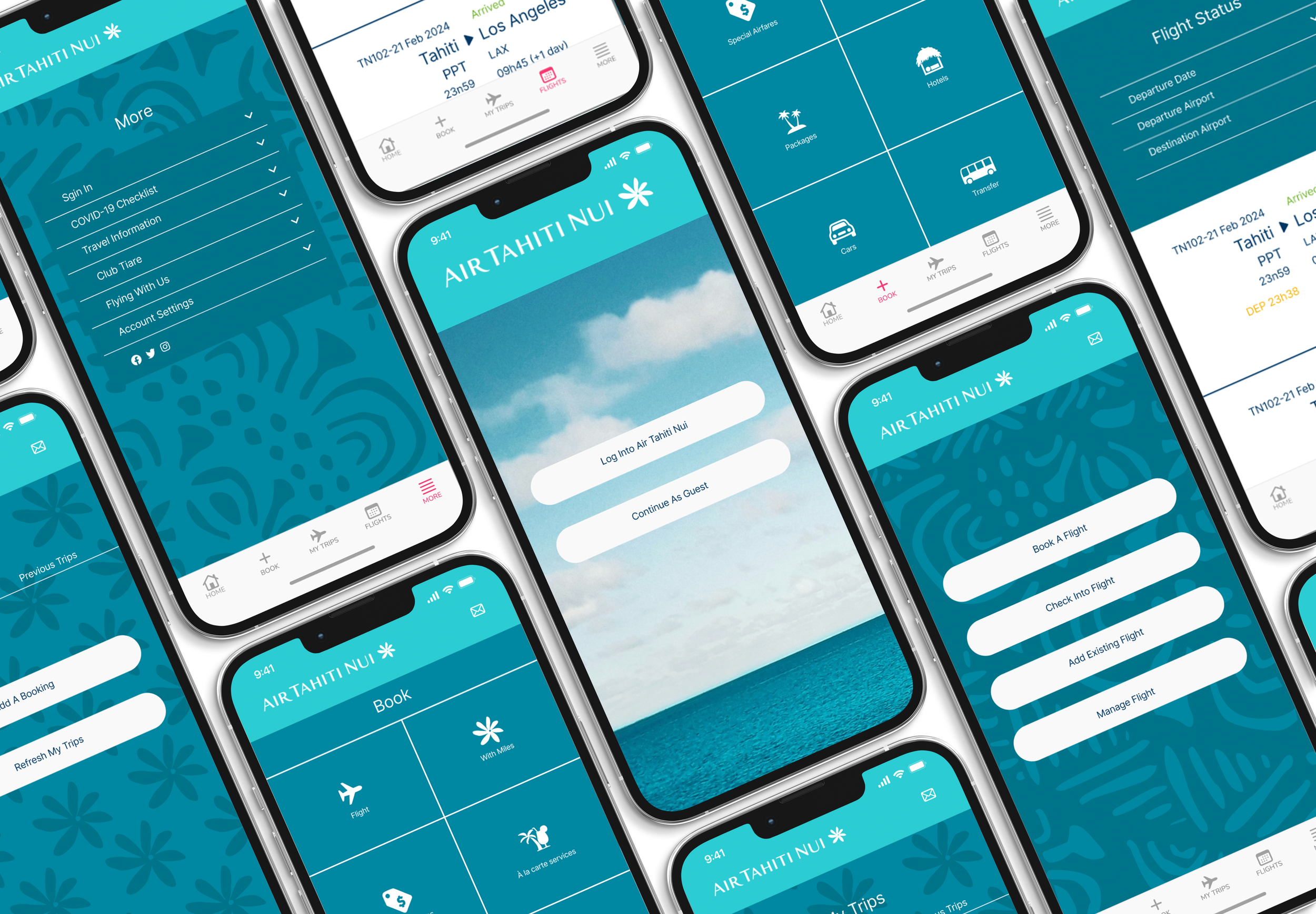
That said, here is my design. I have focused solely on redesigning the pages that users interact with upon initially downloading the app. It's important to note that this project did not undergo usability testing. My objective was to enhance the app's visual design to make it more cohesive and user-friendly. I believe that through thoughtful aesthetic improvements, the app can not only look better but also become more intuitive and enjoyable to use.
Screen one
Implemented a clear call to action on the opening screen to prevent user confusion.
Streamlined the color palette and opted for a singular font for coherence.
Curated the selection of photographs, choosing one that best represented the app's aesthetic.
Screen Two
Simplified the home page to provide clear options and directions for the user.
Implemented multiple access points to different parts of the app directly from the home page.
Designed a Tahitian pattern in Adobe Illustrator, integrating it into Figma as a background inspired by a pattern found on their website.
Screen Three
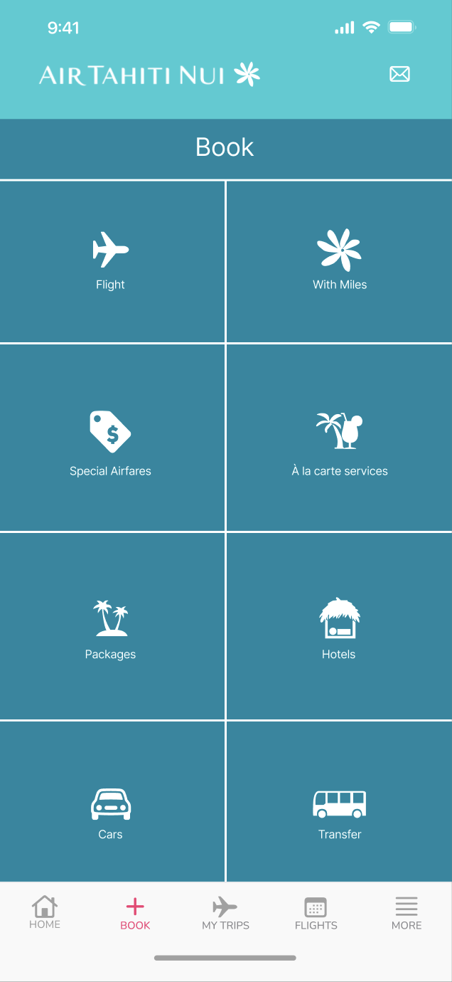
Eliminated the need to scale under a photo to access booking icons by redesigning to open directly to the booking section.
Recreated each icon individually in Adobe Illustrator and imported them into Figma with a few changes.
Retained the size and placement of icons while simplifying colors and background patterns to prioritize the focus on bookings..
Screen Four
Enhanced the page's visual appeal by creating a background in Figma inspired by Air Tahiti's logo, the Tahitian Gardenia.
Simplified the buttons as design they felt unnecessary.
Increased the length of the buttons for improved usability, making them easier for users to click on.
Screen Five
Prioritized simplification on this page by removing random patterns such as the Tahitian and airplane prints.
Utilized a white background to enhance readability and organize the large amount of information present.
Screen Six
Recognized the relatively empty appearance of this page compared to others and sought to enhance its visual appeal while preserving readability.
Reintegrated the Tahitian pattern from earlier, reversed its colors and flipping it vertically to add visual interest.
Kept a text box in the background, because of difficulty of reading text on patterned backgrounds.
Wrap Up
In conclusion, my redesign efforts focused on several key aspects of the Air Tahiti Nui app interface. Firstly, I addressed the lack of clarity in the opening page, aiming to streamline the user experience and minimize the feeling of being overwhelmed by advertisements. Secondly, I worked towards establishing a cohesive color palette derived from the company's branding, aiming to guide users more effectively through the app. Thirdly, I curated the selection of images to maintain authenticity and coherence, incorporating a prominent photo of the ocean to evoke the Tahitian atmosphere. Additionally, I refined the background patterns to align with the brand's aesthetic while minimizing distraction. Furthermore, I prioritized consistency in fonts and colors across the app to enhance overall cohesion. Ultimately, my goal was to create a visually appealing and user-friendly app interface that honors the cultural heritage and values of Air Tahiti Nui.


